ProjectOverview
UPLOADIT
DH 150 2020W Kimberly Jimenez
Introduction
UPLOADIT is a novel UX design of a mobile app that produces a user-accessible experience of image sharing, image viewing, video viewing, and Liking (an important part of sharing and viewing content). Current social media applications that prioritize image sharing forgo to prioritize subsequent aspects, such as, the ease of viewing and Liking images or videos. UPLOADIT prioritizes all aspects of image sharing and allows for a more advanced and organized experience. This is done so through the key features of the app, which include dated tabs to categorize images on profiles, a developed “Likes” page in the Navigation, and video control buttons. The application, though advanced in its features, remains simple to use for all users alike. More specifically, it is for users who enjoy social media, art, photography, image sharing but want to enjoy a thorough experience that allows for rewatching, reviewing, and revisiting.
Design Statement
My goal of the project was to resolve the lack of user control and freedom as well as to improve accessibility to key features of social media applications. Solving the problems aforementioned is important because I hope to produce an experience of image sharing that is worthwhile, easy to navigate, less frustrating, and not time-consuming. Furthermore, I would like for my mobile application to leave users satisfied with its efficiency, knowing the layout and design of the application is organized with their experience in mind.
Competitor Analysis
Heuristic Evaluation
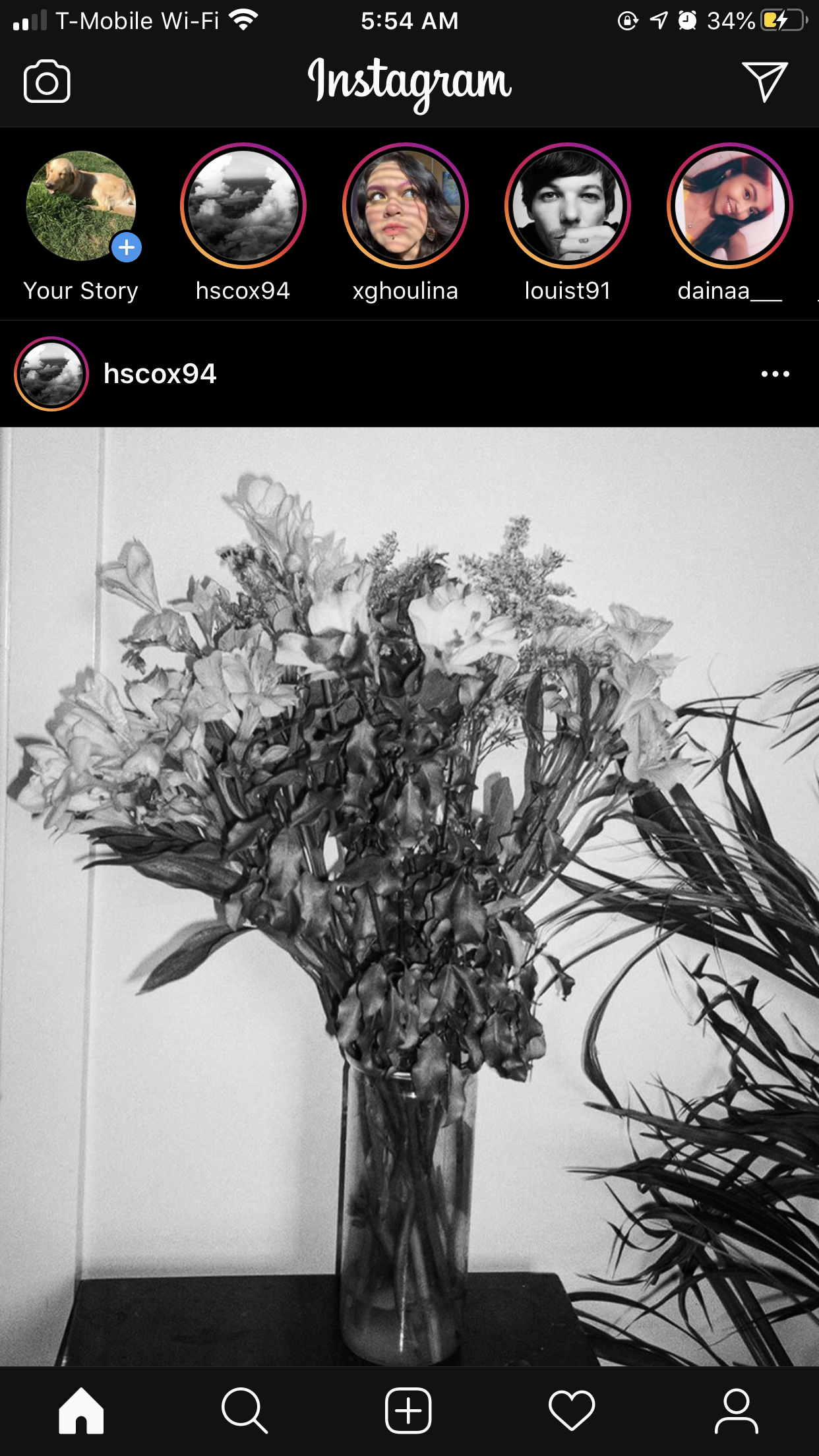
I chose to focus on one popular social media platform, Instagram (available to download here on mobile), to conduct a heuristic evaluation based on Jakob Nielsen’s “10 Usability Heuristics for User Interface Design” and gain insight into what issues need to be resolved. read more…
Instgram

Competitor Analysis
Usability Testing
I conducted a usability test to understand the extent of user freedom and how accessible Instagram currently is. My participant is a friend, a college senior, who has used Instagram in the past, but no longer uses it. Though he does not use Instagram, he is familiar with the way social media applications work. Thus, I thought he would be a perfect participant to gauge the way in which a user that is both familiar and unfamiliar with the app navigates it.
He performed three tasks. The first task included steps to test how users accessed their Likes page. The second task included steps to test if a user was able to control the way they watched a video. The third task included steps to test if a user could control the way they uploaded an image. My participant was not able to thoroughly perform each task, leading him to unsatisfied with his application experience; thus, alerting me Instagram needed to improve. read more…
Click here to view my usability test.
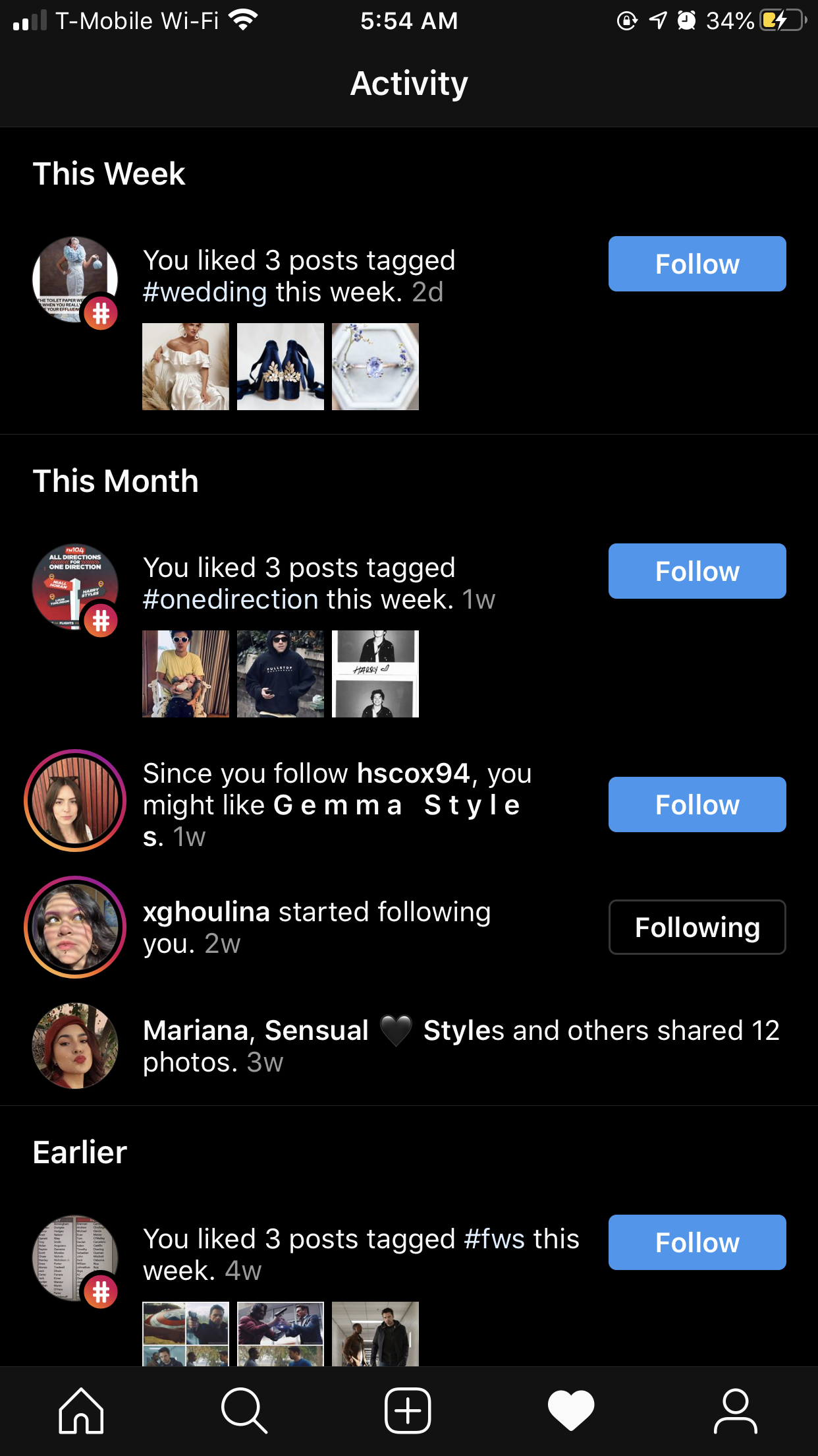
User Research
Though I was able to learn a lot from usability testing, I needed to know more information about how a different user navigates Instagram and what their thoughts were on a (slightly) updated set of usability tasks I had come up with. My participant was a friend, another college senior, who is an advanced user of Instagram. Thus, she would be familiar with the problems I would pose. I interviewed to learn how she would utilize Instagram to find old or specific posts on profile pages and her “Posts You’ve Liked” page. Most notably, she observed the endless scrolling was a feature she was unsatisfied with, which allowed me to design a Likes page with this thought in mind. read more…
UX Storytelling
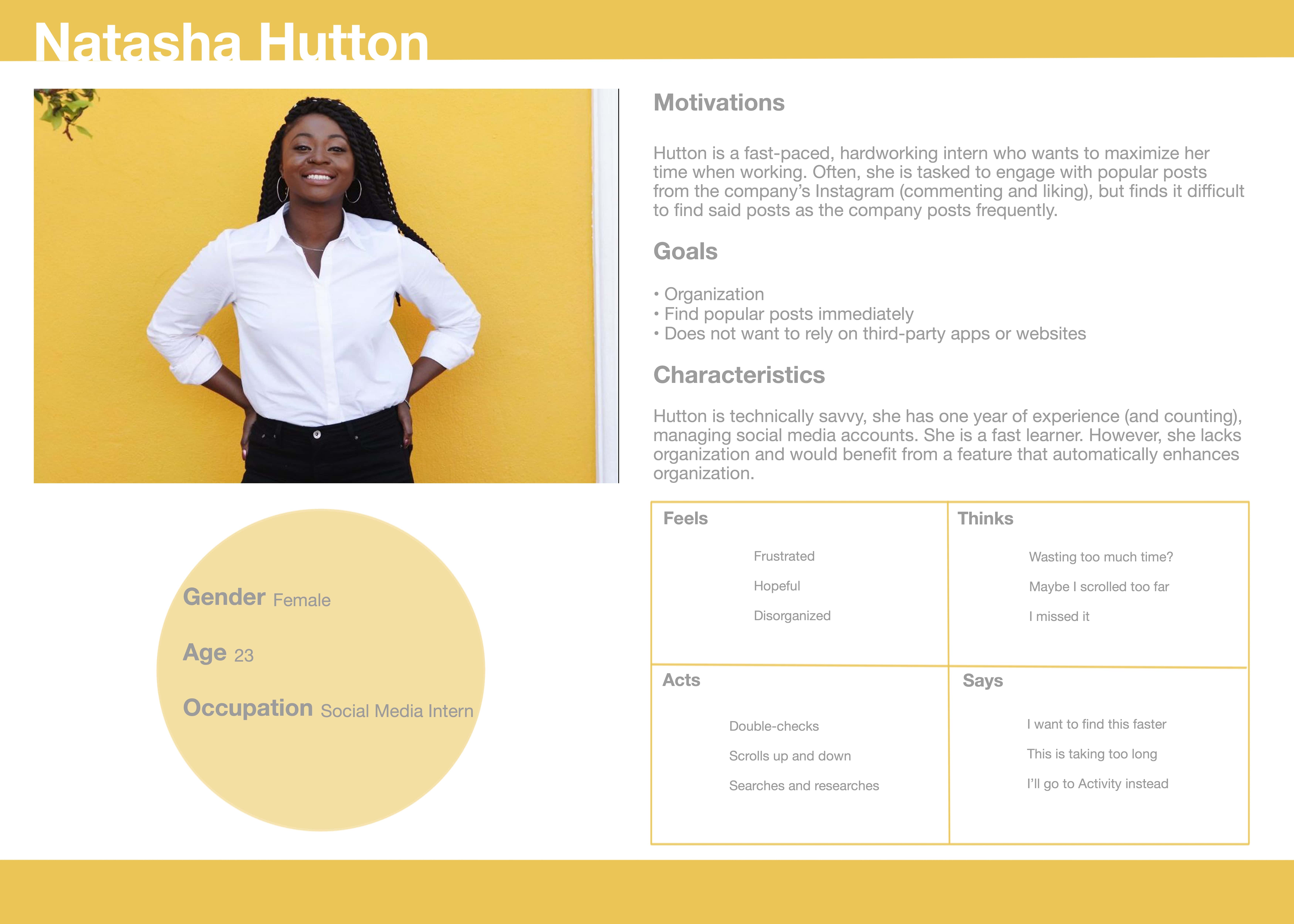
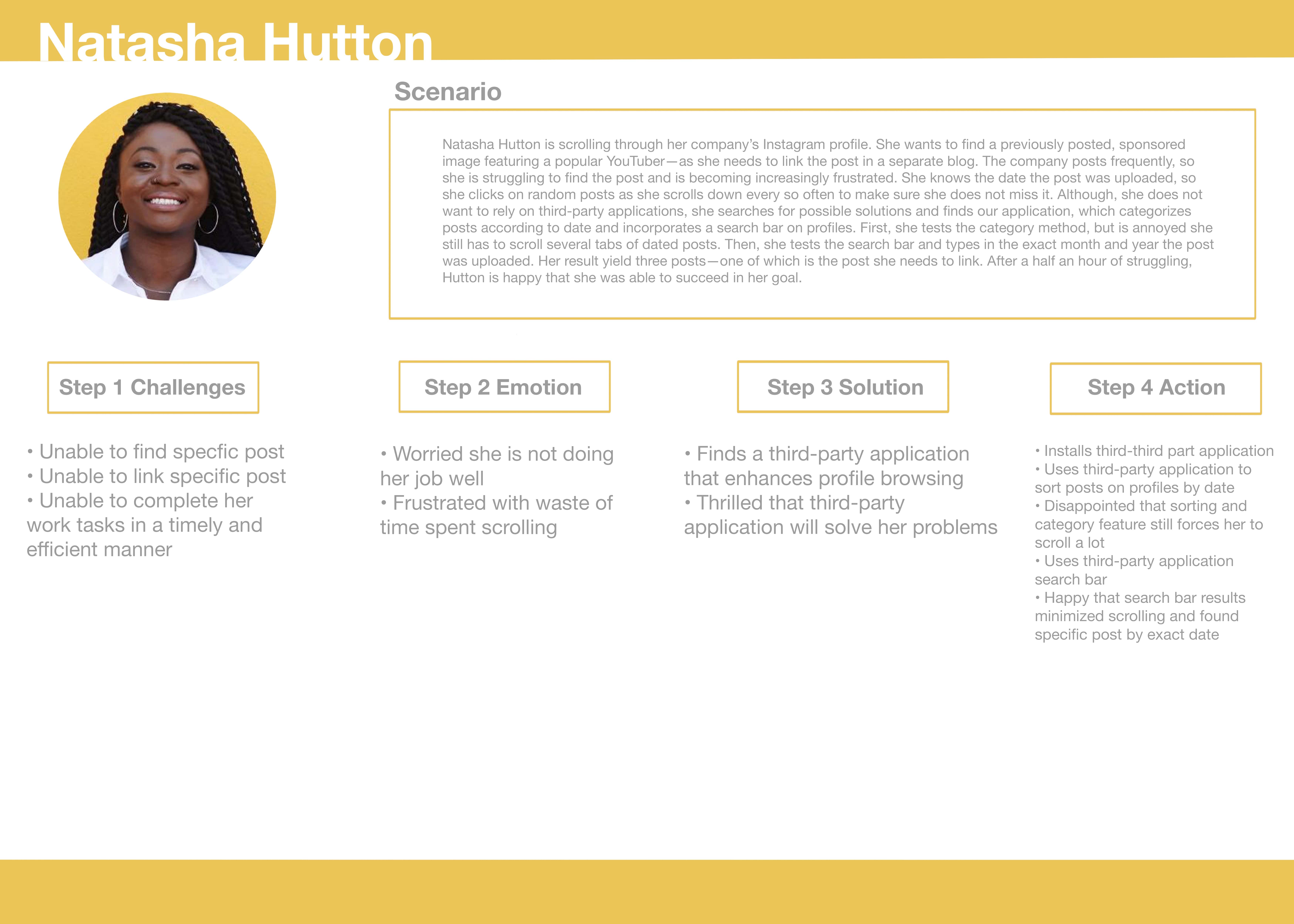
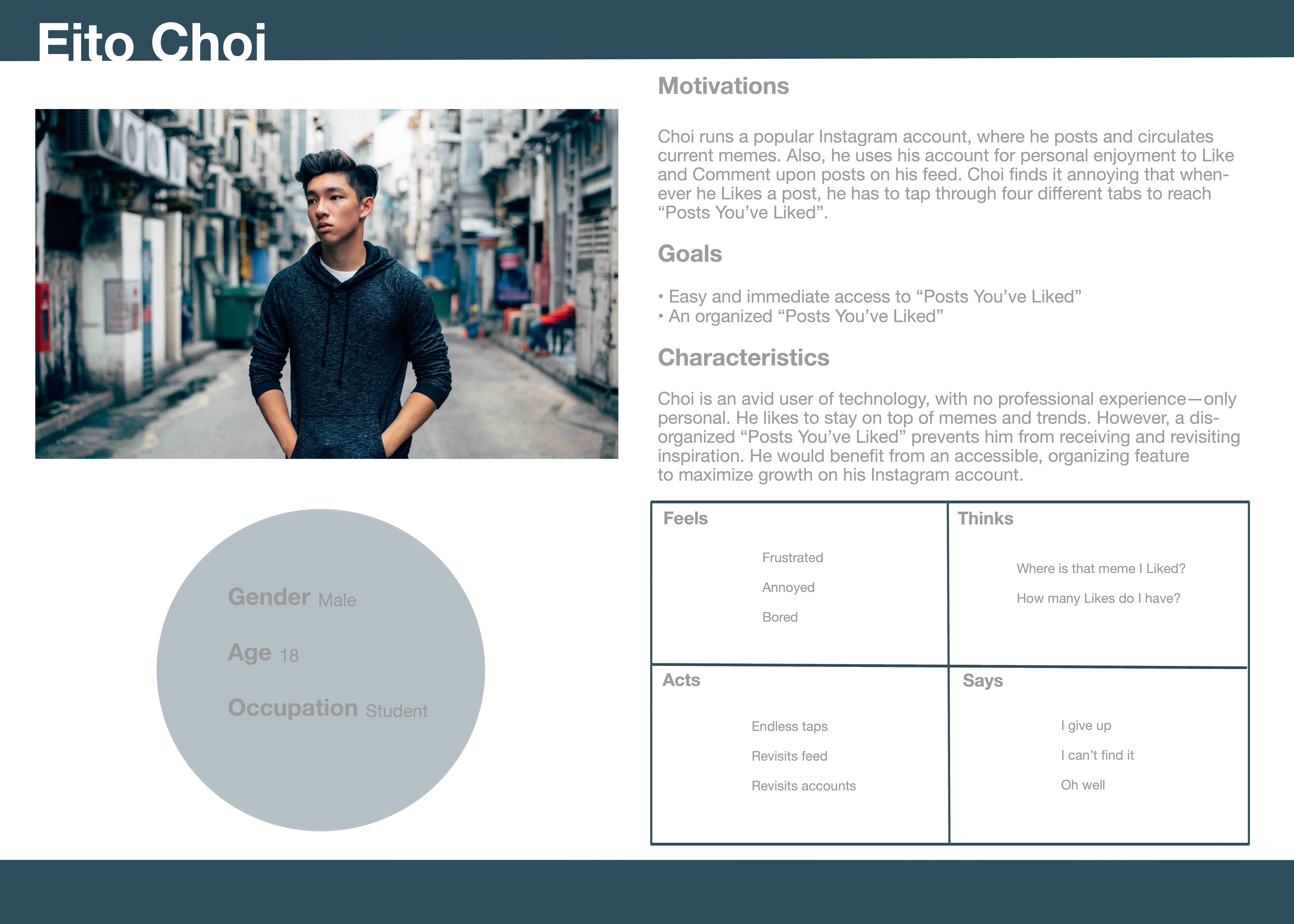
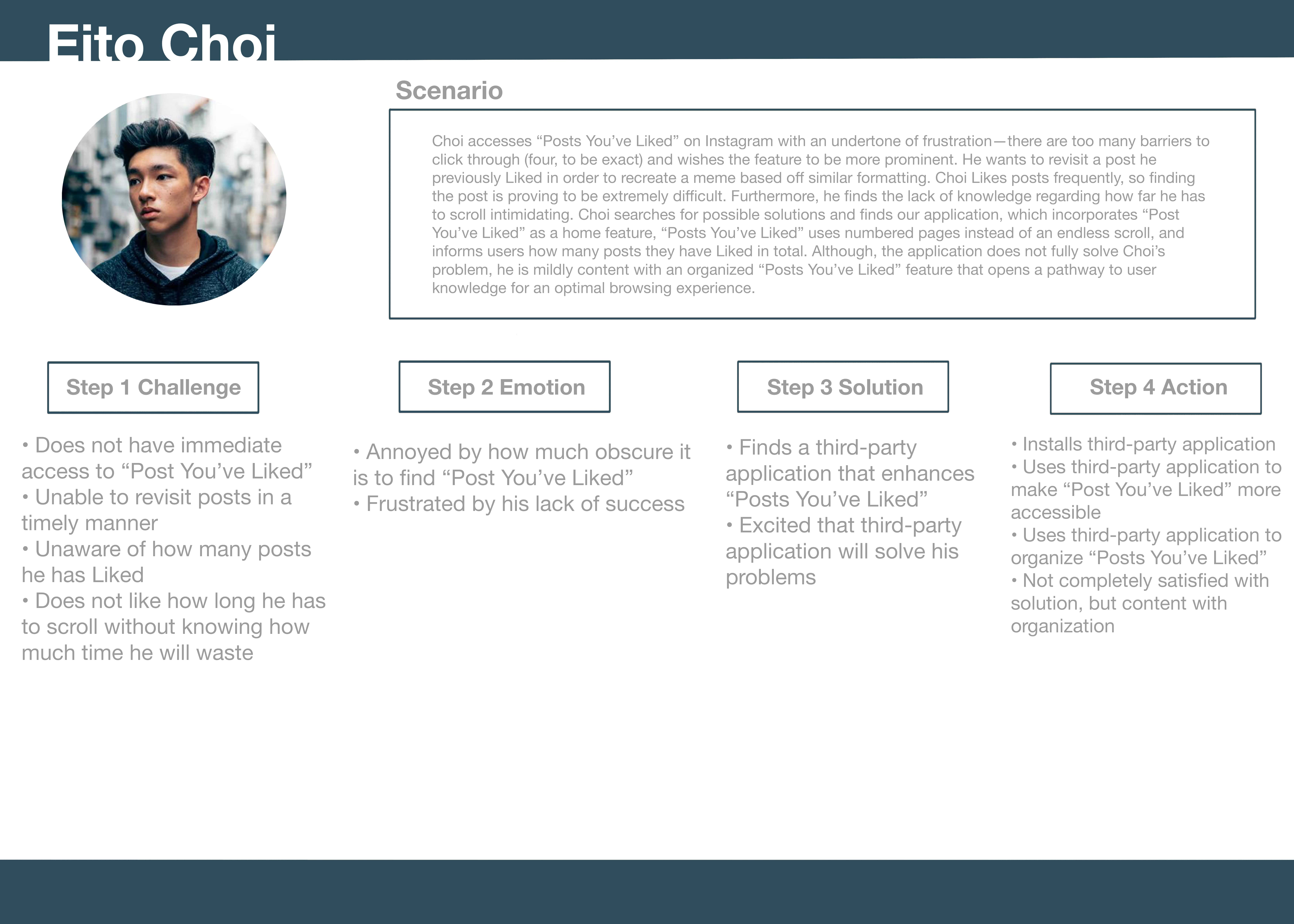
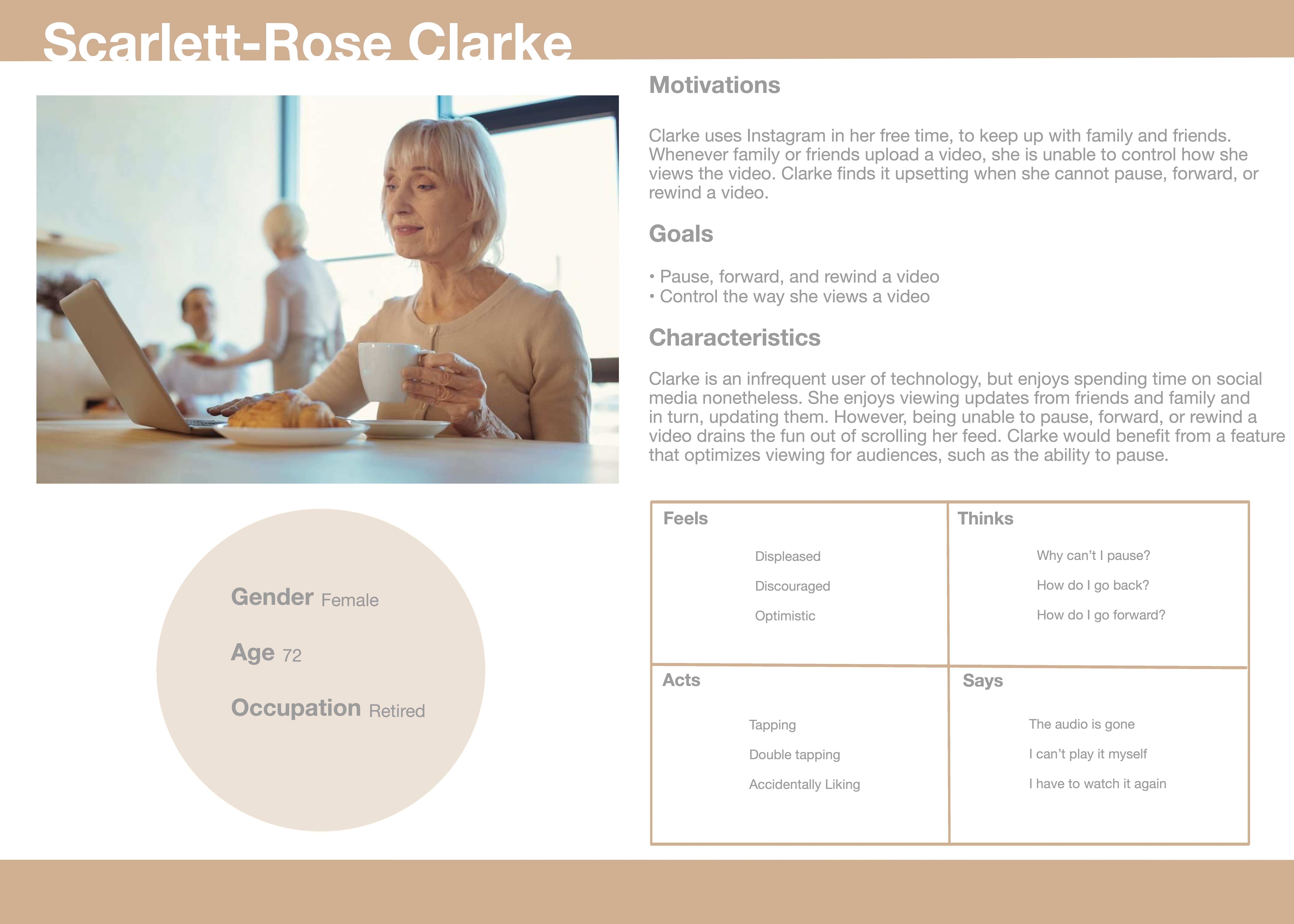
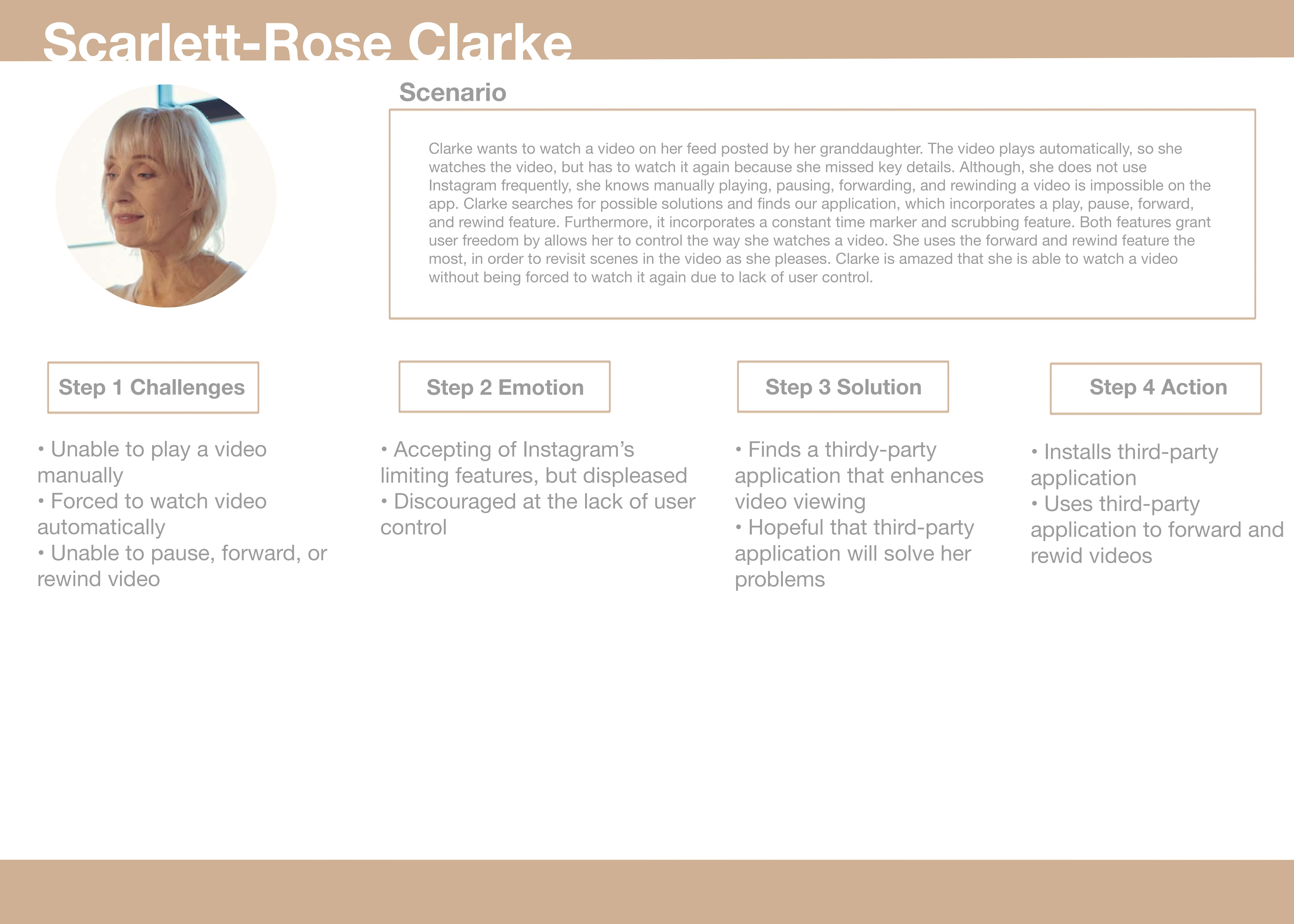
I created my personas based on experience with Instagram to gauge the needs of familiar and unfamiliar users.
Persona 1
Journey Map
Persona 2
Journey Map
Persona 3
Journey Map
Graphic Design Element Variations
In this assignment, I learned how to create accessible color schemes and how to audit those color schemes to test accessibility. read more…
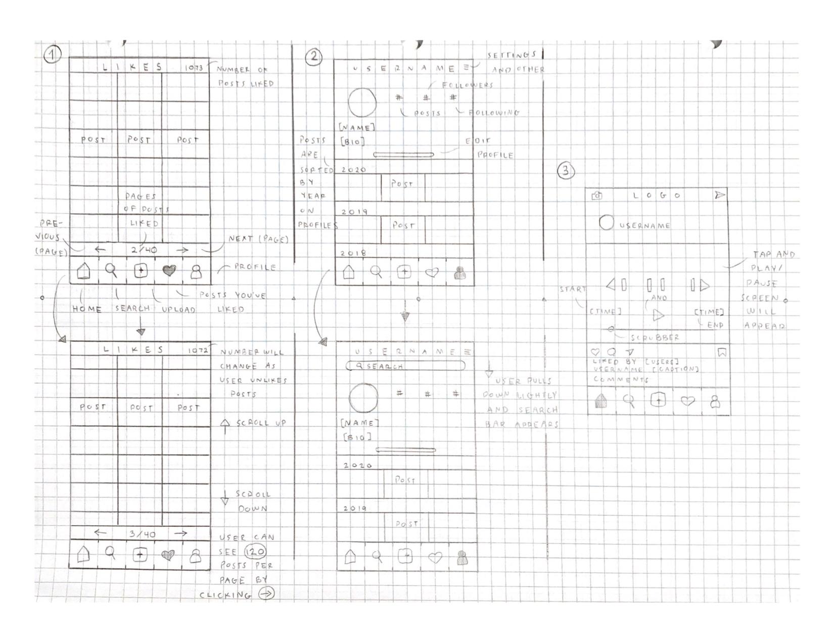
Low-Fidelity Prototype (Wireframes, Wireflow, and Testing)
From usability testing, user research, and personas and scenarios, I created a low-fidelity prototype (which includes wireframes and a wireflow) to layout three different tasks. The first task maps out a search bar and date tabs within Profiles. The second task maps out the number of pages, number of Likes, and a Likes page incorporated as a navigation feature. The third task maps out video control buttons. read more…
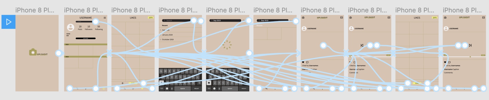
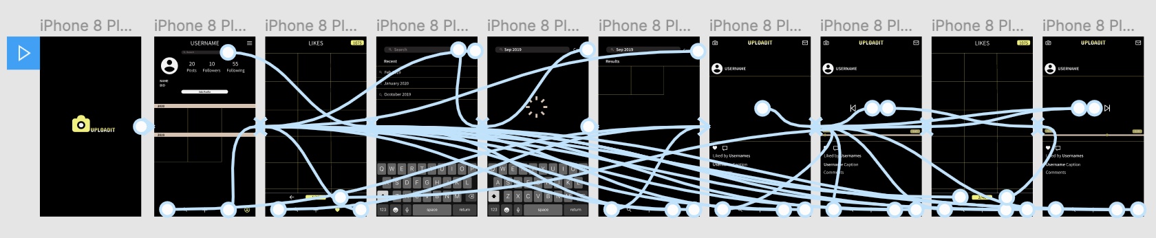
High-Fidelity Prototype
With the help of Figma, I was able to create a high-fidelity prototype using the wireframes, wireflow, and feedback from the low-fidelity prototype testing. The advanced version includes features that are easier to detect and view (automatic over manual). It includes two different color schemes—the original version, with a soothing and aesthetic color scheme and Dark Mode, with colors of the original scheme to make it unique as my mobile application. read more…
Experience the prototype here.
Experience the Dark Mode prototype here.
Pitch Video
Click here to view my pitch video about UPLOADIT.
Conclusion
The course on UX design and research has been very valuable and eye-opening as to what I want to pursue as a career. I have gained a set of skills and learned to work with programs outside of my field of expertise. I learned the incredible importance of low-fidelity prototyping to high-fidelity prototyping. The former is vital in order to gauge changes in features. For example, I originally intended to have a pull-down search bar on Profile pages; however, through low-fidelity prototyping, I learned a manual feature can be inaccessible to users. In the process, I learned how important it is to have a functioning application and to take into account users’ opinions on how the app should cater to their needs, control, and freedom. I will definitely carry these skills outside of coursework.